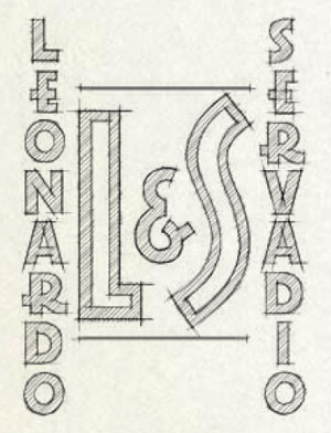
The ellesse logo began as a simple pair of initials. Leonardo Servadio's L&S mark was a guarantee of quality and style.
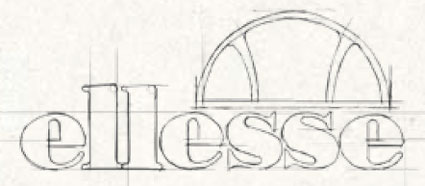
But as the brand grew, so the logo changed. First the brand name ellesse was created from the letters L&S. Later the half ball logo was introduced, combining the tips of a pair of skis with a cross section of a tennis ball, to symbolize the brand's heritage in these sports.
The logo has now evolved and exists as shorthand for the ellesse tradition of innovation in performance and style. It is the signature of one of the most recognized sport lifestyle brands in the world.
 1959: 1959:
The very first logo was made up from Leonardo Servadio’s name and initials L&S. His name was soon dropped from either side so it just existed as L&S.
 1968: 1968:
As the logo evolved it was spelt out with the L&S highlighted as shown below
1975:
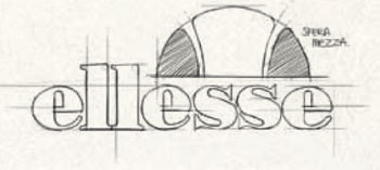 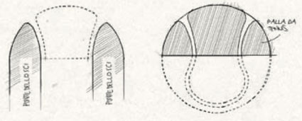 The shaded L&S was discontinued and the half ball device also known as the 'semi palla' was introduced positioned over the 'esse' part of the logo The shaded L&S was discontinued and the half ball device also known as the 'semi palla' was introduced positioned over the 'esse' part of the logo
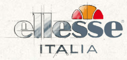 2006: 2006:
The logo remained unchanged through the decades, a symbol of stylish sportswear. The word 'Italia' appeared under the logo to enhance their Italian provenance; the typeface has been modernized to create the logo you see today.
 2010: 2010:
The ellesse heritage range is launched. A modern interpretation of their rich sporting history; each design and communication carries the original heritage logo, a stamp of authenticity and Italian roots.
|